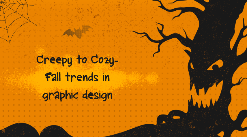
From Creepy To Cozy – Fall Trends In Graphic Design
Even if the summer is quickly becoming a distant memory, there is plenty to look forward to in the autumn, especially in terms of graphic design.
In order to create designs that represent the deep, earthy color palettes, spooky and creepy Halloween-inspired, and natural beauty of the fall months, graphic designers can make the autumn season their source of inspiration.
The audience is ushered into a visually magical land by designers, displacing designs that can be fresh, forthcoming, or centuries old yet trending. To help you incorporate the finest of the transitional season into your own design work, here are inspiring examples of autumn design
To commemorate the changing of the seasons this year, designers are turning to tonal hues and themes based on nature and using scary and spooky designs based on Halloween. These topics span from enjoying nature to creating beautiful 3D images of animals and vegetation.
Get Inspired with these amazing fall graphic designs.
1. Retro
Modern retro style is making a comeback in products, prints, and graphic designs. Whether we were born during those decades or just experienced them through memorable TV shows and music, we are beginning to see more design trends that are evocative of the 1970s, 1980s, and 1990s.
You can use the contemporary retro style to create posters with an autumn theme that includes thick geometric designs, combinations of multiple customized typefaces, bold color palettes, and neon-style components.
2. Candy Colors
We are constantly bombarded with digital content from all directions, making it harder for designers to create artwork, websites, designs, and applications that will stand out from the competition. Thus, it's critical to have an aesthetic appeal that will capture viewers' attention while they're scrolling.
So it is important to ensure the designs you create are endearing. One way to do so is by using eye-catching color combinations that pop. As Halloween smells like candy, so using stunning candy colors like peach, orange, pink, etc. will produce bold and spectacular graphic design masterpieces.
In addition, pastel and pop color schemes are also great options to make a dramatic statement and lighten the Halloween scare.
3. Art Deco
If you are tired of always using vibrant colors, psychedelic designs, and scary artwork, then art deco is another promising design to look for. Art Deco combines sophistication with sleek and elegant, machine-age geometry to give a website, application, or holiday invitation an anti-traditional touch.
The art form is from the early 20th century, where it combined innovation, modernity, and a forward-thinking approach that is characterized by sturdiness, calm, elegance, and resilience. By mixing a contemporary style of design with asymmetric geometrical shapes, it is no wonder that graphic designers are using art deco in their projects.
4. Subtle Animation
A variety of simple animations, such as jack-o-lanterns with glowing red eyes or falling leaves, may give a website design a fall feel. Moreover, the use of relevant design elements and a seasonal animation demonstrates your designs are up-to-date and contemporary.
You can easily mount simple animations for a brief period and then delete them afterward as a season add-on feature. They can also be that small magic amulet that unexpectedly surprises a person.
5. Maximalism
Maximalism — living up to its name is not a new trend in the design world, this movement goes well beyond what you may anticipate. Although it may be easy to compare maximalism to minimalism, it is something more exciting and captivating. Maximalism isn't just about stuffing spaces; it's about stuffing spaces with things, colors, and patterns that reflect the artist's desire.
It's similar to how hoarding may reveal a lifetime's worth of mementos that are meaningful only to the hoarder. What can be a better season to incorporate the trend into your graphic design than Fall?
It is an unrestricted style that displays the full range of a designer's artistic sensibilities. Despite being a bandwagon, it has a lot of staying power since there are constantly fresh discoveries waiting because there are so many things vying for your attention. There are various aspects of fall that might be included to create a heavenly-looking scene for visitors. Photographers and designers are using this style for autumn.
6. Bonus – Turn the Wheel with Newness
Halloween decorations, costumes, and poster art frequently include the colors like ominous green, somber purple, pitch black, and deep orange. However, if you want to draw more attention to your blog, social media visuals, and graphic design elements, consider giving them a fresh perspective. Don't be scared to add a fresh hue to the palette and surprise your viewers. It gives your product a new, distinctive feel that people won't quickly forget.
Although it may sound strange, using beige as the background color will make your elements stand out. Orange colors look great with blue tones. The blue has several shades, yet it doesn't overpower the orange. To avoid having too many tones in one part of the image, it's a good idea to apply and disperse them uniformly when employing a variety of tones. However, if you're trying for a gradient effect, you can ignore this example!
Conclusion
When everything is said and done, the fall graphic design trends are a unique and unanticipated collection. It's difficult to imagine any of these dissimilar designs, from vintage to candy hues or art deco to subtle animation, mixing at a party, but you may accomplish this in the forthcoming season. In fact, you won't want to miss out on any of these erratic mashups in the upcoming year.